The Brief:
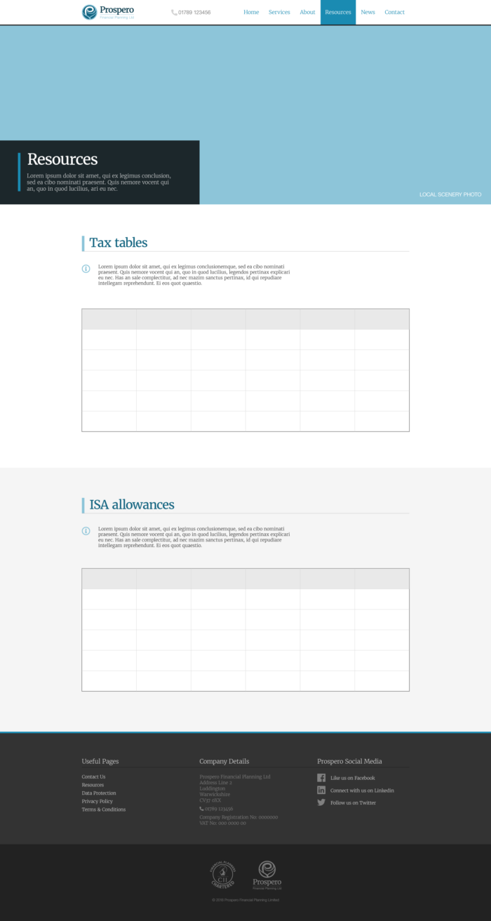
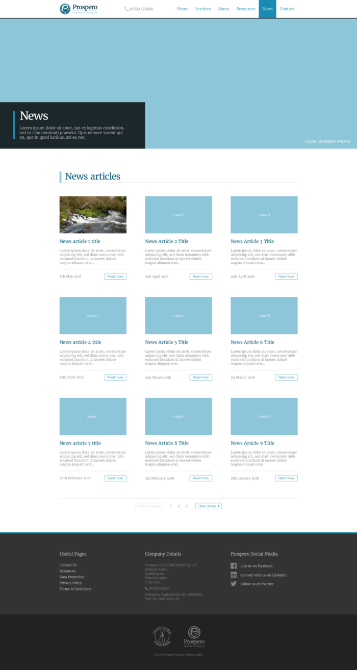
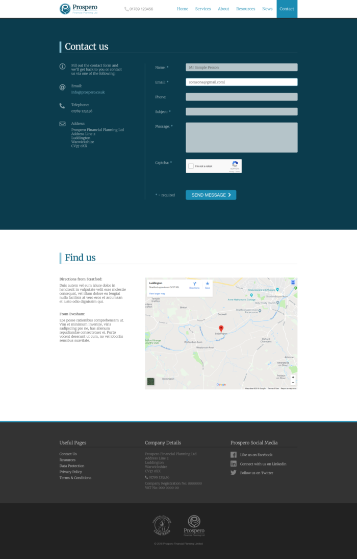
Prospero approached us as they were looking to create a new finance website. They wanted a visitor to have a clear understanding of both their industry sector by the look of the website, as well as the website giving a clear message on landing on any page within the website of what they do.
The company required the navigation of the site to be clear, with any visitors being able to find the financial services they want quickly and easily.
The website needed to be fully responsive on all viewing devices, as well as being fast loading.
The Result:
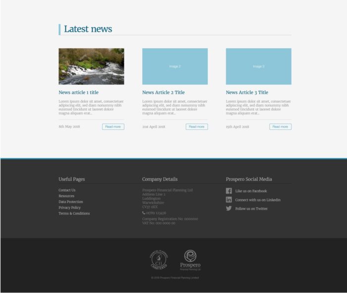
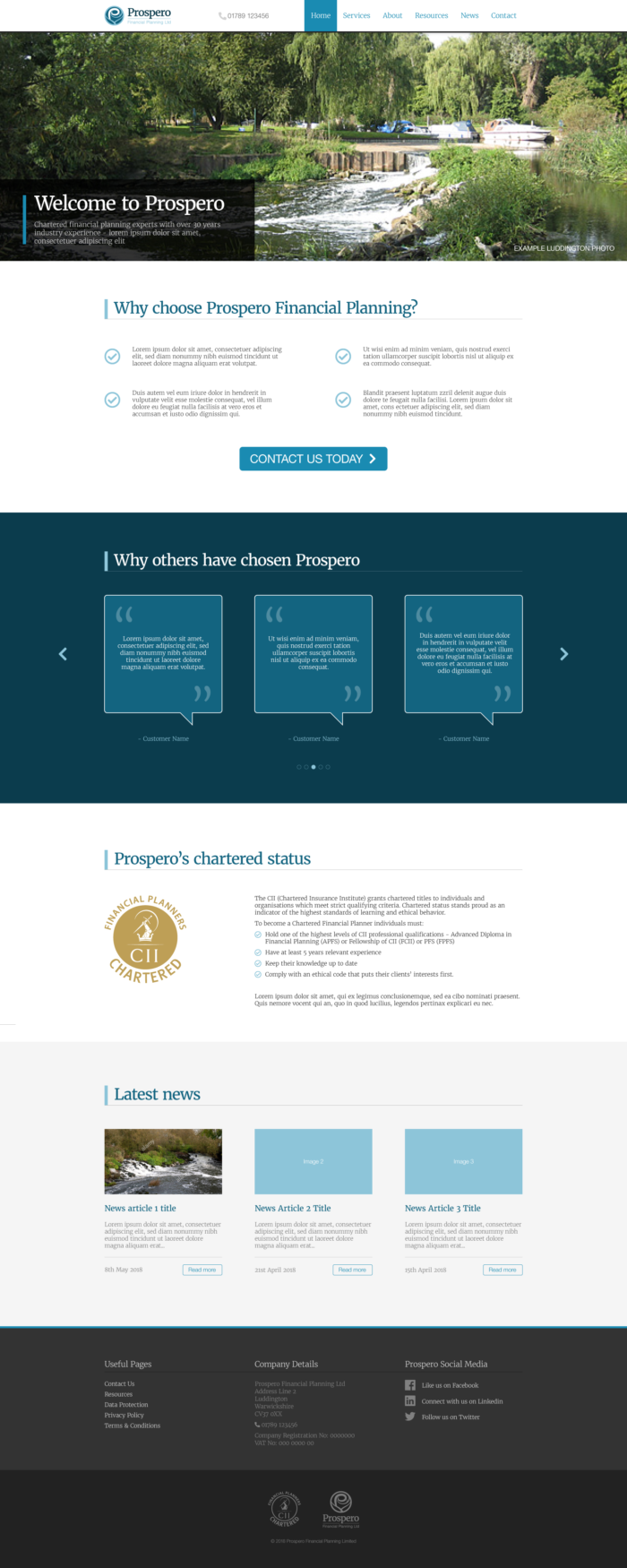
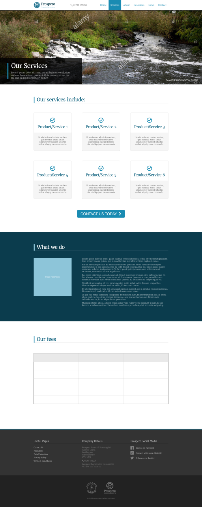
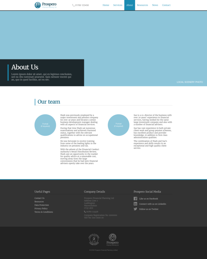
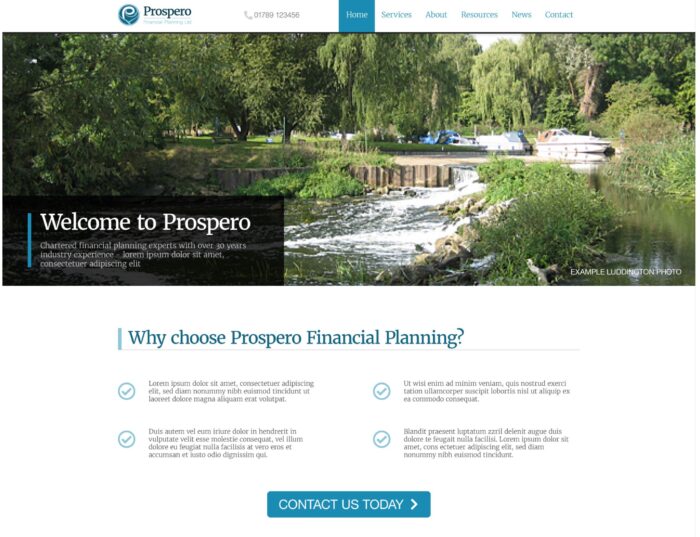
Our design team worked closely with the client to establish the right look for their industry sector (Finance). Blue is associated with giving the feeling of reliability and professionalism. Black suggests luxury, used often in high-end sites, so the combination works well with the companies message.
The layout of the site needed to be eye-catching yet uncomplicated so that visitors could quickly understand the company and the services offered.
The website was fully optimised (standard will all our websites), as well as SSL certified.
The finance website is fully responsive on all viewing devices, as well as fast loading.
