The Brief:
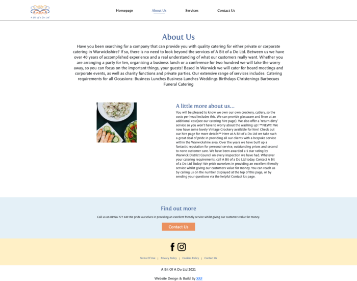
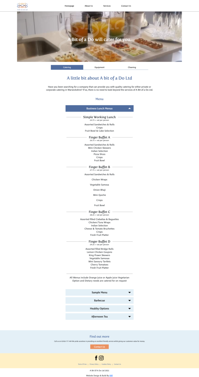
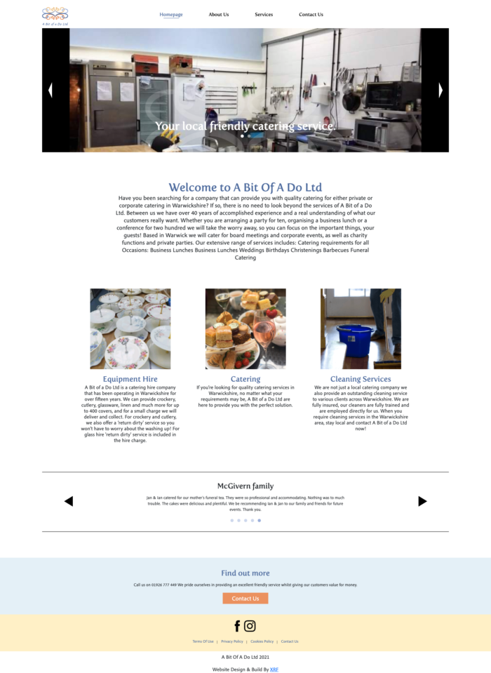
Local catering company A Bit Of a Do required a fast loading brochure website, as their shop window on the internet.
The website needed to be clear on what the company offered and needed to show former customer feedback.

The Result:
A fully optimised website, which loads fast and is viewable on all devices.
The website is designed around a mobile-first meaning that users can easily scroll through, fill out enquiry forms and contact the company easily, delivering an excellent user experience.
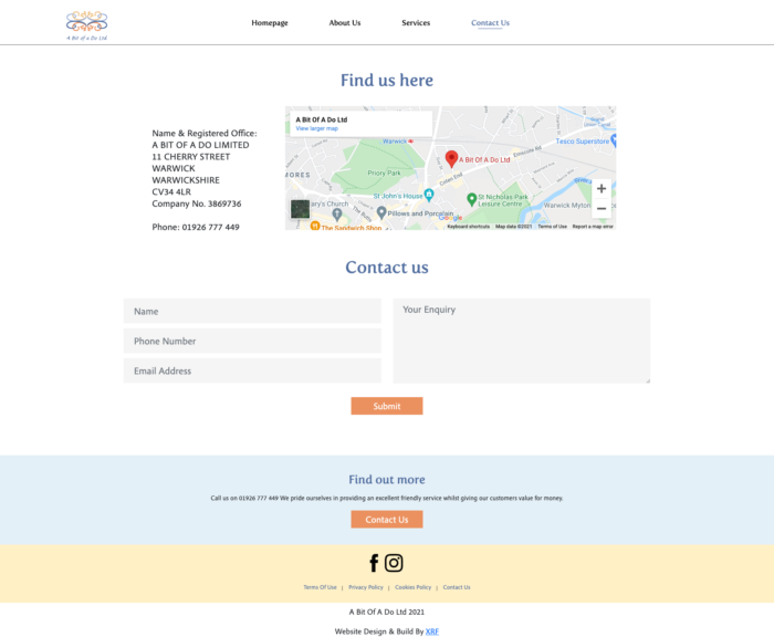
The company relies on local business, and therefore a clear and easy contact us page with a clear location map was important for attracting local customers.
No special functionalities were required with this project, it is a simple yet very effective brochure website.


